3.0: Interface Analysis
Steam’s new UI has now been out for two weeks, which allows a retrospective edge to this analysis that would have been lost were I able to post it earlier, and happily it is almost entirely positive. Were it not for a crash bug when launching mods from a path with a space, only minor and personal complaints would remain and it would be fair to describe the release as entirely successful.
One area in which the release was entirely successful was the public beta it went through before release. Valve have commented on how helpful they found the process and intend to run another beta for the upcoming SDK update (currently pencilled for next week). Rag Doll Kung Fu has also made use of the feature in the UI’s wake.
In a general sense, Steam’s new UI leaves the vector-driven 2.0 and takes a step back to the more graphical 1.0. This gives Steam a clunkier feel with far more unused space, which though some will hate on principle isn’t necessarily a bad thing when it comes to widespread perceptions. The main focus of the redesign, though, are these three key ideas that are repeated throughout:
- Reducing the number of separate windows
- Blurring the lines between games and mods
- Giving users greater control over how they organise products
We will look at each area in turn to see how these changes have been applied.
Analysis
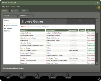
Nowhere are the three clearer than the main screen. We can see that Browse Games, Play Games, Monitor, elements of the Properties panels and the main menu, and, through the View menu, the systray context menu have all been merged into one frame, using a tab bar to keep the interface uncluttered. My Games, the tab shown to the left, no longer forcibly separates mods and games, conforming to the second point. The default sort on the tab, by status, puts them below full games, but this can be changed to anything you like – a part of the third ‘pillar’, control of organisation, which also extends to choosing columns and collapsing different categories (Games/Tools/Not Installed) in the mini-list. The control isn’t quite complete though: you might be able to sort your lists, even hide them, but there is still no way to completely remove products that you own but aren’t interested in, nor form a truly custom order.
On the developers’ end, gameinfo.txt can now be used to give team names, a homepage, and an icon, each of which are displayed in the list like official titles.
Store, the replacement for Browse Games which is designed with standalone browsers in mind as well as the client, also holds to all three pillars. Games are displayed in tables which can be sorted by columns, there is now a search function, and the improved structure has been justified in the short term by merging the previous tabs, individual games and mods, into the one list with only price to tell them apart. The packages on offer have been tweaked too, with not entirely benign results. The new package structure will be covered in an article of its own.
As well as bulking Steam’s offerings up quite nicely for casual users, the longer list reveals the woefully inefficient HTML used to render it. Quite why five lines of code are needed for what should be a simple link and CSS button (or at least image) is a question best left unanswered. Equally mysterious is the odd choice of colour scheme: turquoise and maroon against the UI’s green and black/grey. Feel free to make a comment if you’ve any leads. The last Store oddity is Valve’s continuation of remotely hosting it, when something that is updated so infrequently would clearly be better off stored locally. Only the new search feature can justify its serverside location.
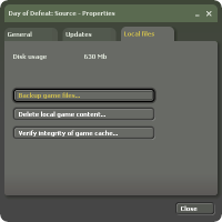
As you might expect, not everything has been moved into the main screen. Preparing to Play (now Preparing to Launch) remains for one, with only the subtle change of naming the mod that launches and not its parent game. Properties also remains, though with the somewhat hypocritical change of splitting the settings into three tabs (left) and in dire need of memorising the last used tab. On the other hand it is now partially available for mods, breaking down yet another barrier between them and full games. Bandwidth Monitor, a late addition which now sports a counter to show how much Steam has downloaded, also has a separate window, and there is also, at long last, a UI option to validate a game’s local content.
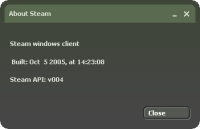
The final area of interest is, perhaps unusually, the About dialogue. It gives us two very important hints to some of 3.0’s functionality: firstly that it specifies the Windows client, implying that there will be a Linux version too; and secondly that it mentions the Steam API, information that is only useful for third party developers – as far as Steam in concerned, plug-in writers. It is a theory that fits nicely with the new tabbed interface, and how much room it has for additions.
Conclusion
Did the interface achieve its goals? It has stuck very well to the three keystones I identified at the start of this analysis, but seeing as they were identified by working backwards that means little. Insofar as the usual aspects of usability and efficiency are concerned it has made great strides with minimal error, which is the best conclusion we can reach. Here’s hoping that the remaining bugs will be fixed, and the tantalising clues scattered throughout the redesign turn one day into fully-fledged features!


One Response to this post:
Comments
1 Trackbacks/Pings
Future Steam technology wrap-up - The Steam Review